Wow, its been a little while since I posted a blog entry. My mom in town, a new job, and my new duties with the Houston Photographic Society have taken my free time these last 3 weeks. Well, it is time to get back into the weekly grove here.
One topic that came up at our last print competition with HPS, was when do you use black and white(B&W) versus color. This is a bit of a preference of the artist/photographer, but there are times when B&W is definitely the way to go.There are several things that are competing for a viewers attention:
- the color red
- bright highlights
- faces
- text
- sharp focus, and then
- the placement of your subject
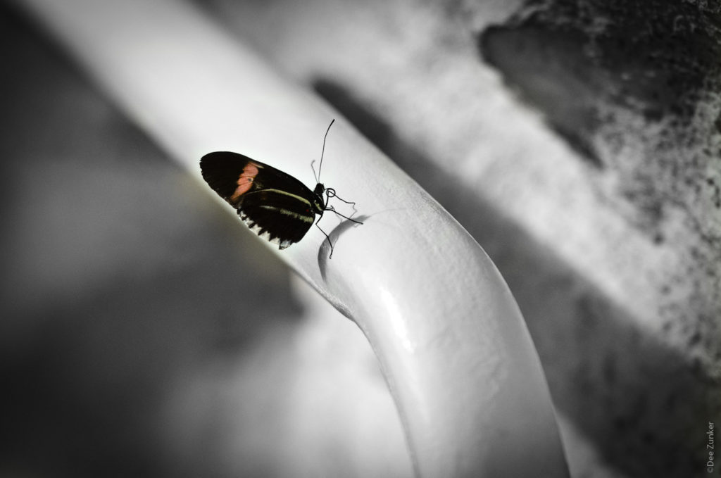
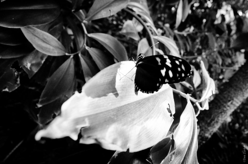
One of those times to use black and white is to remove distractions from your main subject. Here is a photo that really must be in B&W to work.
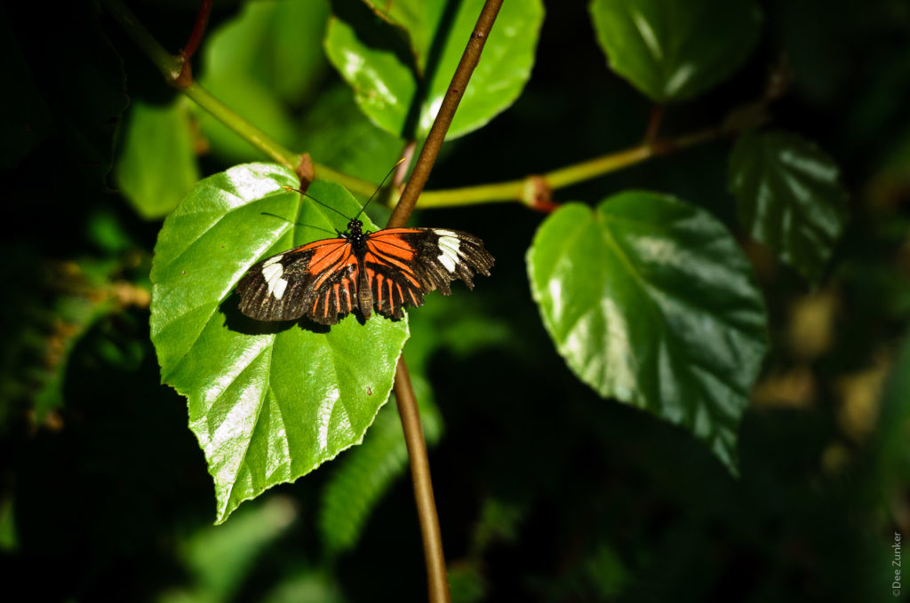
And here is the color version. The pink stripes in the color version totally distract from the butterfly in the center of the photo. While the girl in the background is out of focus, the colors of the shirt and the man’s hand behind the butterfly draw attention away. I like the desaturated look, so I tried to tone down the color, but that did not work either. I had to go to complete black and white to get the butterfly to be the focus of attention.
I do love color, but as I am maturing as a photographer, I am appreciating B&W more and more. The subtle changes in tones make B&W very interesting. And studying B&W images is like studying light. If you have not already played with black and white, I encourage you to do so. Its pretty easy with Photoshop Elements.

Good shooting until next week.
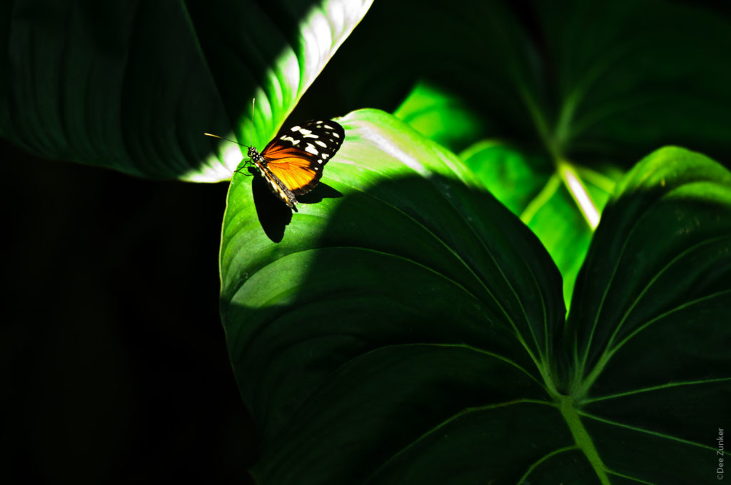
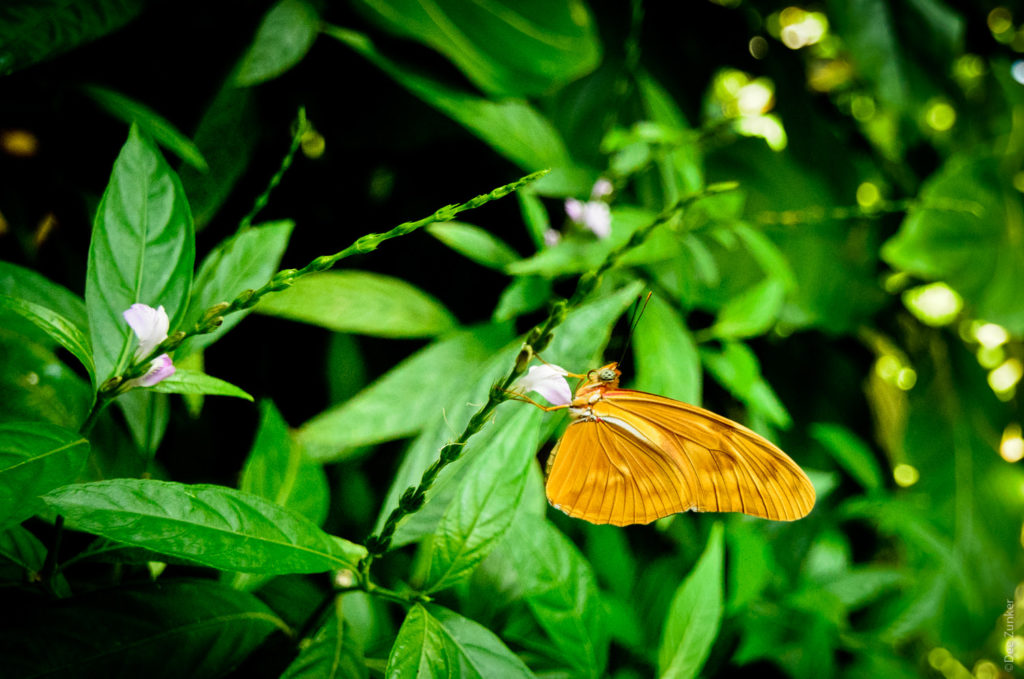
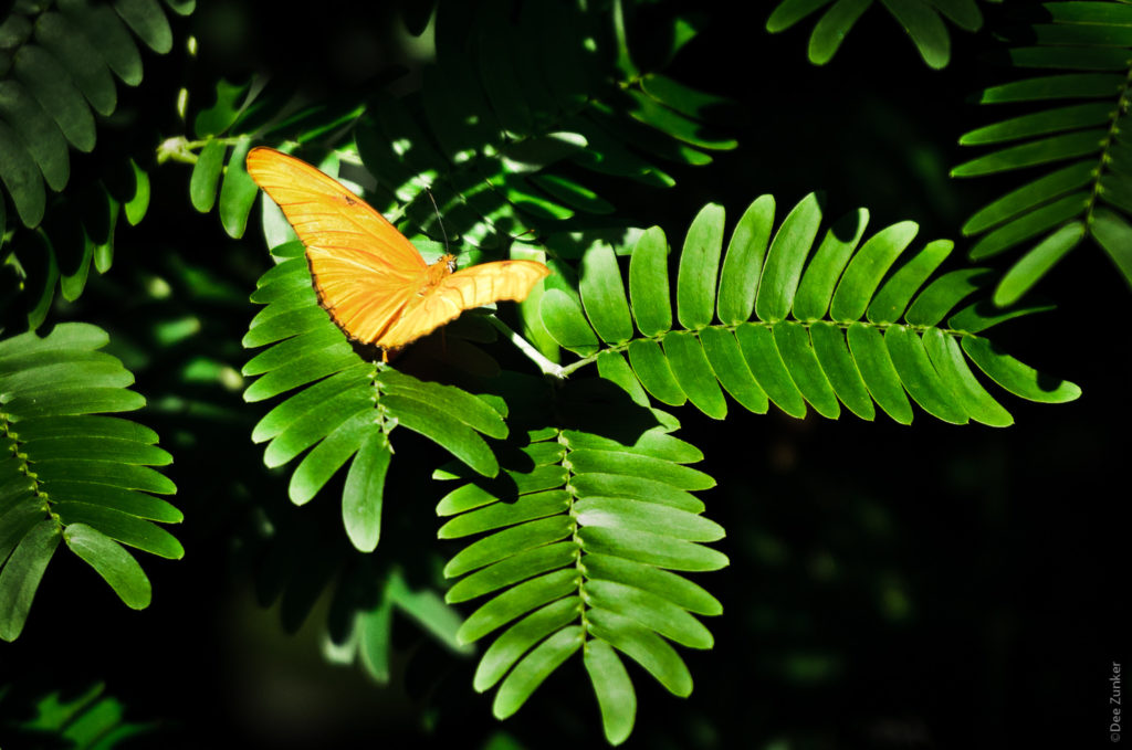
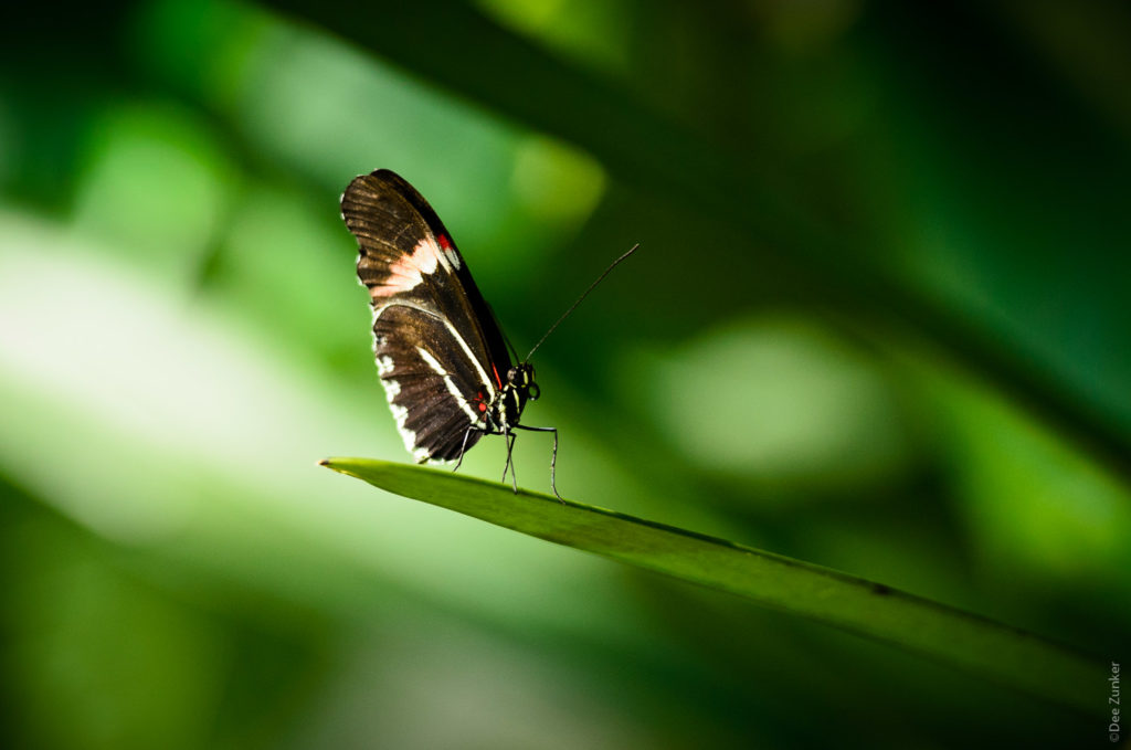
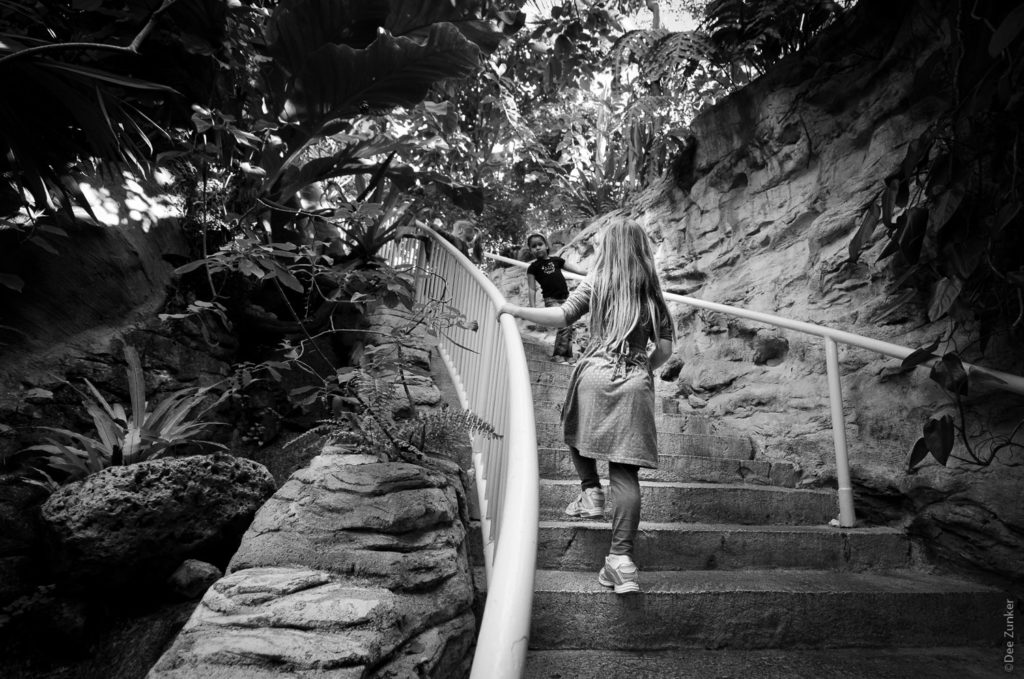
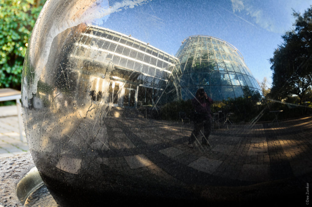
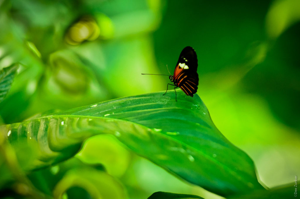
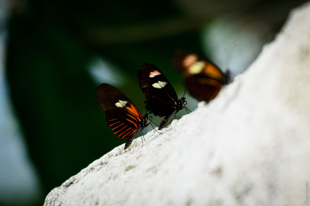
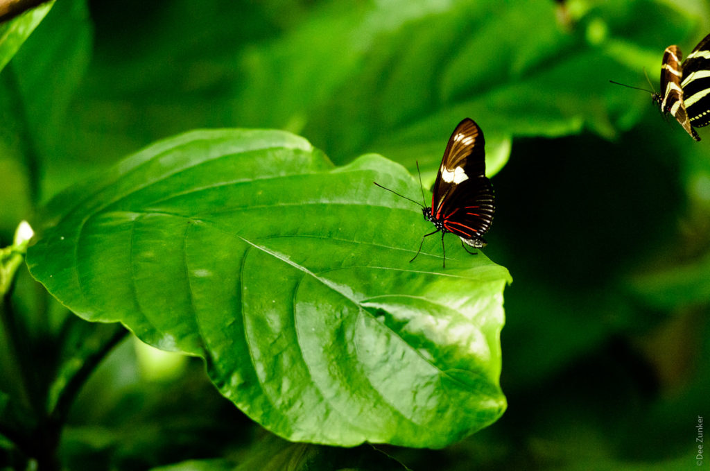
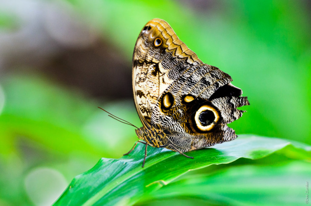
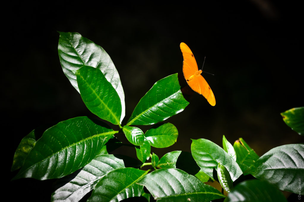
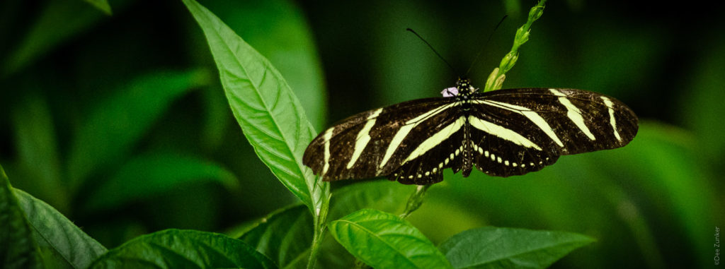
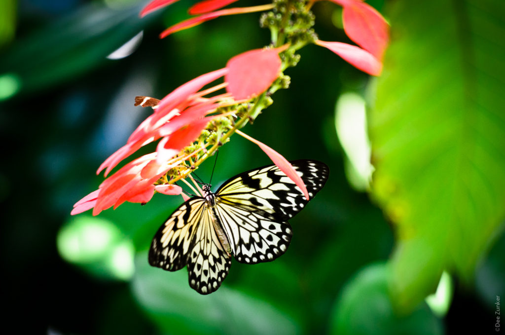
Here are some more images from the Butterfly Museum here in Houston.